Abigay’s Farm. Designing the cover.
Publication Day and Kindness
27/10/2021LAUNCH DAY for Abigay’s Farm! 10th November 2021
13/11/2021Yesterday I received a very interesting comment on Messenger. “I love that friendly cover, Odette such a warm, practical mood about it!” (Thank you Penny D…. That means a lot.)

The process of assisted self-publishing is very different from traditional publishing. With the latter you are presented with a cover and usually you just say “Yes. Nice”. (Maybe very famous authors have more influence. I don’t know.)
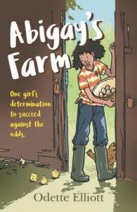
With SilverWood books you can make many decisions yourself. When it came to thinking about the cover, I had already asked the artist Patrice Aggs if she could provide a colour picture. I suggested maybe having Abigay collecting eggs. She had already done one about this early on in the story, but it seemed to be the best idea for the cover.
So. We had a colour picture and I liked it immediately. I was then presented with a questionnaire by the Cover Design Team. One question was ‘How do you want a child to feel when they see the cover?’. I think I said “I’d like the child to think She looks friendly and very at home on the farm. She’s the kind of girl I could be friends with.
The next question was “What font do you want used? They also suggested looking at books in bookshops, especially those in the same genre. Well. That was a challenge, as there were books in many different genres, humour, mystery, adventure, science fiction. Mine did not seem to fit into any of those. Then I decided that Abigay’s Farm is ‘realistic fiction’.
When it came to fonts, again there are so many to choose from. As I studied them, I could see that a curly, fiddly kind of font was not what I wanted. Nor did I want a very severe-looking extra plain one. I saw a font called Chalkduster and saw it as the possible handwriting style of quite a strong, likeable character, so I chose that.
I answered all the questions and then it was over to the Cover Design Team. They chose white for the main title and bright yellow for the subtitle. They placed them beautifully so that they show up against the brown barn door. My name as author is in green, matching the interesting green in shadow inside the barn and that is in a traditional font that looks like times New Roman to me. I am happy with the whole design.
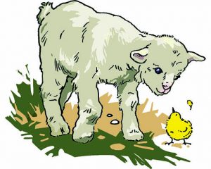
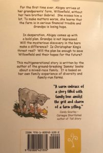
There was also the back cover. The only input I had there was to write the blurb and then to ask Patrice if she could provide a small image because I thought this would be attractive to a child reader. I love the little kid (animal not child) and the fluffy yellow chick looking at each other!

The design team put Candy Gourlay’s statement in a similar font to the title and it stands out really well. (Thank you Candy!)

Then came yet another decision. Did I want a matt finish or glossy? Going back to bookshops did not help me here. I discussed this with my husband and in the end, we decided on glossy.
Now what I want is heaps of children to get the book, either by buying it, or being able to borrow it from libraries. I hope they will be attracted by the cover and that they will love the story inside!
If YOU like the story, please spread the news. Thank you!


